Plume Creator Solarized
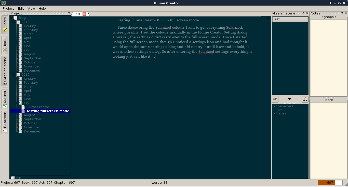
I wrote recently about discovering Plume Creator and the first thing I set out to do on all applications I use is to try and see if I can get it to use the Solarized colours.
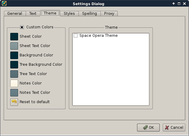
You can bring up the Theme settings either through the menu Edit - Manage Styles or directly by pressing F7.

That worked well and I kept some of the colours on the right side since I’m not sure if or how I will use the Notes window yet.

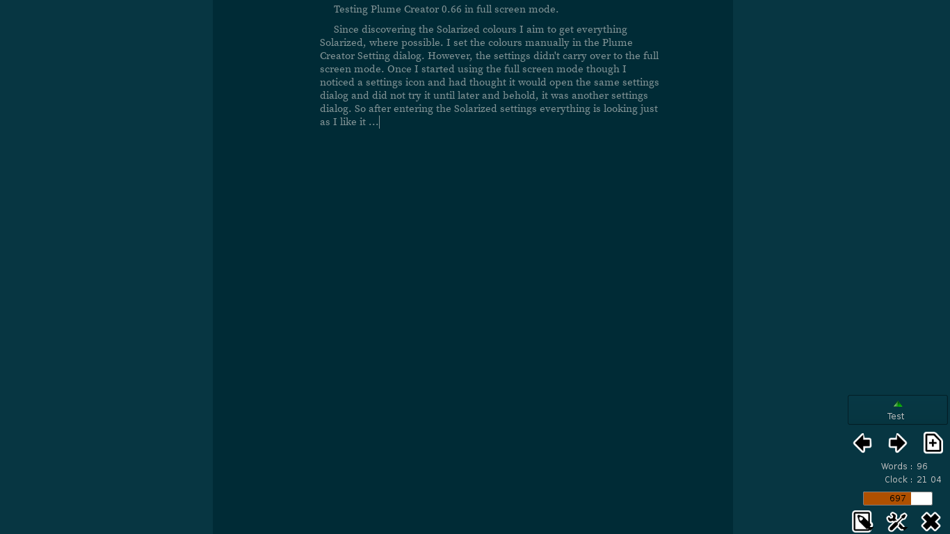
After that I went into the Full Screen mode, which you can do either through the menu View - Fullscreen or by pressing F11. The full screen mode is a feature I really like. I have been looking at other editors and the full screen mode with as little distractions as possible besides what I’m actually writing is golden. To my disappointment my Solarized colours did not carry over to the full screen mode and it was the standard black background and white text. Doh. So, being an open source kind of person I went into the source and browsed the files there for the actual theme setting for the full screen mode. Not being a coder and definitely not familiar with C++ I didn’t find anything useful for me. So I gave up.
Once I started using the full screen mode though, I noticed the settings icon in the bottom right corner again, and since I had thought it would only open the same settings dialog as mentioned above I had actually never tried it. Lo and behold, it was another settings dialog! So after entering the Solarized settings there as well everything is looking just as I like it …
